
The European Accessibility Act (EEA) is a game-changer for anyone building digital products in or for the European Union. Simply put, it's a directive that pushes businesses and developers to ensure their digital services and products are accessible to everyone, including people with disabilities. This means websites, apps, and even digital kiosks must meet certain accessibility standards, creating a more inclusive digital space. Sounds fair, right? But it also means that as developers, building for accessibility can no longer be seen as an optional task in the backlog—it's a critical part of the development process, just like performance or security.
At ustwo, our commitment to inclusivity is guided by key principles: using the right tools, adopting reusable patterns, and continuously testing for accessibility. These principles not only ensure our products are accessible but also help us deliver meaningful, inclusive experiences for everyone. Tools like Radix fit naturally into this approach, bridging the gap between accessibility best practices and practical implementation.
Accessibility isn't just a nice-to-have—it's essential. Think about it: the web is supposed to be for everyone, but without accessibility, millions of people are left out of the conversation. It's not just about compliance or avoiding fines; it's about creating experiences that truly work for all users, regardless of their abilities. Plus, accessibility often leads to better usability overall—keyboard navigation, clear labels, and intuitive interfaces benefit everyone, not just those with specific needs.
That said, building accessible web applications can feel overwhelming. Many developers struggle with understanding what's required, let alone implementing it correctly. It's easy to miss subtle details, like proper focus management or using ARIA roles effectively. And let's not forget the time it takes to test everything across devices and assistive technologies. Accessibility can feel overwhelming, but the good news is that with the right tools and mindset, it's manageable—and that's where solutions like Radix come in.
Radix: A Developer-Friendly Tool for Accessible Components
Enter Radix, a library that feels like it was tailor-made for React developers who want to nail accessibility without losing their minds. At its core, Radix provides a set of unstyled, accessible UI primitives that do a lot of the heavy lifting for you. Think of it as a toolbox packed with components that already handle things like keyboard navigation, ARIA roles, and focus management—all those tricky details that often trip us up when building from scratch. If you've ever spent hours trying to debug why a dropdown doesn't work properly with a screen reader, you'll immediately understand why Radix is worth your attention.
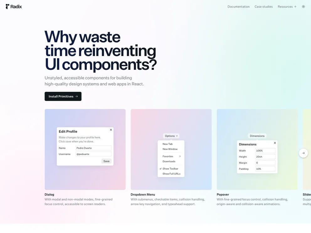
The magic of Radix lies in how it seamlessly aligns with WCAG (Web Content Accessibility Guidelines) standards. Accessibility isn't just an afterthought here; it's baked into the foundation. Every component is designed to meet the requirements for an inclusive experience, which means you're starting with a solid base rather than patching things up later. Whether you're building modals, tooltips, or menus, Radix ensures they work as they should for all users. It's like having an accessibility expert reviewing your code in real time.
Now, you might be thinking, "Can't other libraries do this?" Sure, there are plenty of component libraries out there, but most come with trade-offs. Popular ones like Material UI or Bootstrap are great for getting something up and running quickly, but accessibility often requires extra effort or custom fixes. Radix flips that script—it's not about quick styling or flashy components; it's about providing rock-solid building blocks that you can style and extend however you like. If you're serious about creating accessible, customisable interfaces, Radix feels less like a library and more like a superpower.
Accessibility Compliance Without Radix: A Common Pitfall
Let's be real—building accessible components from scratch sounds noble, but it often turns into a headache faster than you can say "ARIA roles." Take a dropdown menu, for example. At first glance, it seems simple: a button to open it, a list of items, and some basic interactions. But when you start thinking about accessibility, things get messy. You'll need proper keyboard navigation, focus management, and ARIA attributes to make it usable for everyone. If you're not careful, your dropdown could go from “looks good” to “compliance nightmare” in no time.
import React, { useState } from "react";

export default function Dropdown() {
  const [isOpen, setIsOpen] = useState(false);
  const toggleDropdown = () => setIsOpen(!isOpen);

  return (
    <div>
      <button onClick={toggleDropdown}>Options</button>
      {isOpen && (
        <ul>
          <li>Option 1</li>
          <li>Option 2</li>
          <li>Option 3</li>
        </ul>
      )}
    </div>
  );
}
Looks fine, right? But this version fails accessibility tests in several ways. First, it doesn't support keyboard navigation—users relying on the Tab or Arrow keys to move through options are out of luck. Second, there's no focus management. When the dropdown opens, focus should move to the first item, and it should return to the button when the dropdown closes. Lastly, ARIA attributes are missing entirely. A screen reader has no way to announce the relationship between the button and the menu or describe the items inside.
Now imagine an app full of components like this. Fixing these issues isn't just tedious; it's error-prone and time-consuming. Worse, it could leave you non-compliant with the EEA, risking both legal trouble and the alienation of users who rely on assistive technology. And we haven't even touched on edge cases yet—like what happens if you hit Escape or click outside the menu.
As a quick note: the first port of call should always be using semantic markup. For example, a
<select>element is perfect for this type of interaction and provides built-in accessibility features. But when you need to implement custom UI that goes beyond the native capabilities, Radix has you covered.
This is where Radix could have saved the day, but we'll dive into that next. For now, it's clear: building accessible components without the right tools can feel like walking a tightrope, and the smallest misstep can derail your compliance efforts.
Using Radix to Solve Accessibility Challenges
Let's revisit our dropdown menu, but this time, we'll build it using Radix. Spoiler alert: things are about to get a lot easier. Radix components come preloaded with accessibility features that take care of the heavy lifting—keyboard navigation, focus management, ARIA attributes—you name it. It's like having an accessibility expert sitting next to you, but in code form.
import * as DropdownMenu from "@radix-ui/react-dropdown-menu";

export default function Dropdown() {
  return (
    <DropdownMenu.Root>
      <DropdownMenu.Trigger asChild>
        <button>Options</button>
      </DropdownMenu.Trigger>
      <DropdownMenu.Content>
        <DropdownMenu.Item>Option 1</DropdownMenu.Item>
        <DropdownMenu.Item>Option 2</DropdownMenu.Item>
        <DropdownMenu.Item>Option 3</DropdownMenu.Item>
      </DropdownMenu.Content>
    </DropdownMenu.Root>
  );
}
And just like that, you've got a fully accessible dropdown menu. Let's break down what's happening here. First, keyboard support is built in. Users can open the menu with the Space or Enter keys, navigate through the items with the Arrow keys, and close it with Escape. You didn't have to write a single line of code for this functionality—it just works.
Next, focus management is handled automatically. When the dropdown opens, focus moves to the first item in the menu. If the user presses Escape or clicks outside the dropdown, focus returns to the trigger button. This is the kind of detail that's easy to overlook but critical for accessibility. Radix ensures that focus behaves predictably without any extra effort from you.
Finally, ARIA attributes are seamlessly applied. Radix components take care of labeling the menu and its items, ensuring screen readers announce everything correctly. The button knows it controls the dropdown, and the items are described in context—all without you having to touch ARIA attributes directly.
That said, custom components like dropdowns are one of those edge cases where ARIA roles become necessary. While semantic HTML should always be the first choice, tools like Radix step in when native elements, like
<select>,` don't meet design requirements or UX needs. Even then, testing your components is crucial—our inclusivity guidelines remind us that no solution should be trusted blindly. Make sure to test your Radix-based components with real assistive technologies to ensure they work as expected in practice.
The result? A dropdown menu that doesn't just look good but also works for everyone, meeting the European Accessibility Act's requirements without breaking a sweat. Radix bridges the gap between accessibility theory and practical implementation, letting you focus on building features instead of debugging edge cases.
By using Radix, you're not just saving time—you're future-proofing your app. Accessibility audits become easier, compliance becomes a given, and, most importantly, you're delivering an experience that works for all users. That's a win-win in any book.
But the power of Radix doesn't stop at functionality. One of its standout features is how effortlessly it integrates with your app's design system. Radix components are intentionally unstyled, giving you complete control over how they look while maintaining their accessible behavior out of the box. This means you can craft a user interface that aligns perfectly with your brand without sacrificing compliance or usability.
Take the example from Radix's official documentation: a beautifully crafted dropdown menu that not only handles accessibility challenges but also looks polished. The CSS allows for customization with precision—control over animations, colors, spacing, and shadows lets you seamlessly embed the component into any design language. For instance:
.DropdownMenuContent {
  min-width: 220px;
  background-color: white;
  border-radius: 6px;
  padding: 5px;
  box-shadow:
    0px 10px 38px -10px rgba(22, 23, 24, 0.35),
    0px 10px 20px -15px rgba(22, 23, 24, 0.2);
}
This snippet showcases the flexibility Radix offers for creating visually appealing components while ensuring they behave as expected for all users. You can go further by styling states like data-highlighted or data-disabled, making the user experience intuitive and engaging. These subtle touches—like using var(--violet-9) for a highlighted menu item—enhance accessibility while aligning with modern design aesthetics.
Radix also supports advanced use cases. Want to create a submenu? Done. Need to handle state changes for checkboxes or radio items? No problem. With components like DropdownMenu.CheckboxItem and DropdownMenu.RadioGroup, Radix provides the building blocks for interactive, accessible UIs without reinventing the wheel.
This modularity is where Radix shines. It lets you focus on building great experiences, knowing the foundation is solid. Whether you're adding animations, adjusting focus styles, or embedding your dropdown into a complex layout, Radix ensures you're compliant with accessibility standards while retaining complete creative freedom.
In a world where accessibility and design often feel like opposing forces, Radix proves they don't have to be. It's a tool that empowers developers to deliver interfaces that are not just compliant and functional, but also a pleasure to use and beautiful to look at. It's hard not to be excited about the possibilities when accessibility and customization are no longer a trade-off.
Practical Benefits of Adopting Radix
The beauty of adopting Radix isn't just in what it does—it's in what it saves you from. Let's face it: accessibility audits can be a time sink. Manually reviewing components to ensure they meet standards like WCAG feels like playing a never-ending game of whack-a-mole. Fix one focus issue, and suddenly you're dealing with keyboard navigation quirks. Radix flips that script by giving you components that are already compliant out of the box. Instead of spending hours debugging why a screen reader isn't announcing a menu properly, you can focus on shipping features.
Take the example of a dropdown menu we've been discussing. With Radix, you don't need to write custom logic to manage focus or bind keyboard events—it's already handled. Here's a practical snippet showcasing how even advanced interactions, like checkboxes in a dropdown, are simplified:
<DropdownMenu.CheckboxItem
  className="DropdownMenuCheckboxItem"
  checked={isChecked}
  onCheckedChange={setIsChecked}
>
  <DropdownMenu.ItemIndicator className="DropdownMenuItemIndicator">
    <CheckIcon />
  </DropdownMenu.ItemIndicator>
  Enable Feature
</DropdownMenu.CheckboxItem>
This isn't just about saving time; it's about confidence. Knowing your components are accessible means fewer surprises during audits and smoother reviews from accessibility teams. It's the kind of peace of mind that's hard to put a price on, especially when compliance with regulations like the European Accessibility Act is non-negotiable.
Future-proofing is another major win. Accessibility standards evolve, and keeping up can feel like running a marathon. With Radix, you're not running alone. The library is actively maintained to align with best practices and emerging standards. That means your app doesn't just meet today's requirements—it's better positioned for tomorrow's updates. Whether it's handling new ARIA roles or supporting upcoming browser changes, Radix ensures your foundation remains solid.
And let's not forget the users themselves. By taking care of the technical details, Radix allows you to focus on delivering a better experience for everyone. Accessible components aren't just for users with disabilities—they improve usability across the board. Features like intuitive keyboard navigation or clear visual states make your app more enjoyable for everyone, whether they're using a mouse, a screen reader, or just trying to tab through your UI in a hurry.
In the end, Radix is more than just a tool; it's an investment in building apps that are inclusive, future-ready, and delightful to use. It frees you to spend less time worrying about compliance and more time crafting experiences that matter. And isn't that what we, as developers, signed up for in the first place?
Beyond Compliance: Why Accessibility Matters
Let's talk about the bigger picture. Accessibility isn't just about ticking boxes to meet regulations—it's about creating digital experiences that truly welcome everyone. Think about it: the web is one of the most powerful tools humanity has ever built, but it only fulfills its potential when it's accessible to all. When you design with accessibility in mind, you're not just building for users with specific needs—you're crafting experiences that are easier, more intuitive, and simply better for everyone. Accessibility is like the secret ingredient that elevates your app from “good enough” to exceptional.
But beyond the warm and fuzzy feeling of doing the right thing, accessibility can be a competitive advantage—especially in markets like the European Union, where compliance with regulations like the EEA is non-negotiable. Companies that prioritize accessibility aren't just avoiding fines; they're expanding their audience. Think about the millions of potential users who rely on assistive technologies or benefit from accessible design practices. Meeting their needs isn't just ethical—it's smart business. An app that's easier to navigate with a keyboard or works seamlessly with a screen reader will always stand out in a crowded market.
And speaking of ethics, let's not sugarcoat it: designing for accessibility is the right thing to do. We often hear about user-centered design, but if your design excludes an entire group of people, is it really user-centered? Accessible design levels the playing field, giving everyone equal access to information, services, and opportunities. It's not just about “helping” people with disabilities—it's about recognizing their place in your audience and treating their needs with the same importance as anyone else's.
Here's a simple example that illustrates this mindset. Imagine you're building a button that opens a modal. With Radix, you're already getting proper focus management and ARIA attributes baked in:
<Dialog.Root>
  <Dialog.Trigger asChild>
    <button>Open Modal</button>
  </Dialog.Trigger>
  <Dialog.Content>
    <Dialog.Title>Important Info</Dialog.Title>
    <Dialog.Description>
      This modal is fully accessible, ensuring all users can interact with it.
    </Dialog.Description>
    <button>Close</button>
  </Dialog.Content>
</Dialog.Root>
This tiny bit of extra care ensures that everyone—from someone navigating with a keyboard to a user relying on a screen reader—can interact with your app. And that's the heart of it: accessibility isn't an add-on. It's a fundamental part of good design.
Ultimately, accessibility is about building a better web. It's about ensuring no one is left behind, creating apps that people trust and enjoy using, and leading the way in inclusive, forward-thinking design. It's not just a feature—it's a responsibility, and tools like Radix make it easier to step up to the challenge. Let's embrace it, not just because we have to, but because it makes everything we build better for everyone. That's a win we can all get behind.
Conclusion and Key Takeaways
Accessibility can feel like a daunting challenge, but tools like Radix turn it into an opportunity—a chance to build better, more inclusive apps without breaking a sweat. By simplifying the most complex aspects of accessibility, Radix empowers developers to focus on what they do best: creating exceptional user experiences. Whether it's seamless keyboard navigation, focus management, or ARIA attributes, Radix takes care of the details so you can meet the European Accessibility Act (EEA) requirements with confidence. No more second-guessing if your dropdown menu or modal is compliant—it just works.
What's even better is that you don't have to overhaul your entire app to start benefiting from Radix. Start small. Pick a single component in your project—a dropdown, a modal, or a tooltip—and try out Radix. You'll quickly see how it improves not just accessibility but also your development workflow. It's an investment that pays off in usability, compliance, and the satisfaction of knowing your app works for everyone.
Here at ustwo, we're passionate about building digital products that make a difference. Accessibility isn't just a checkbox for us—it's a core value. We believe in creating experiences that include everyone, and we know the right tools make all the difference. Radix is one of those tools that helps us achieve our mission. Whether we're designing for mobile, web, or beyond, we're always thinking about how to make technology more human, more inclusive, and more impactful.
So, here's our challenge to you: take a closer look at how accessibility fits into your workflow. Try Radix on your next React project, and see how it can simplify the process while improving the end result. Because at the end of the day, accessibility isn't just about compliance—it's about building a better web for everyone. And as we like to say around here: let's make things better, together.
Live long and prosper 🖖